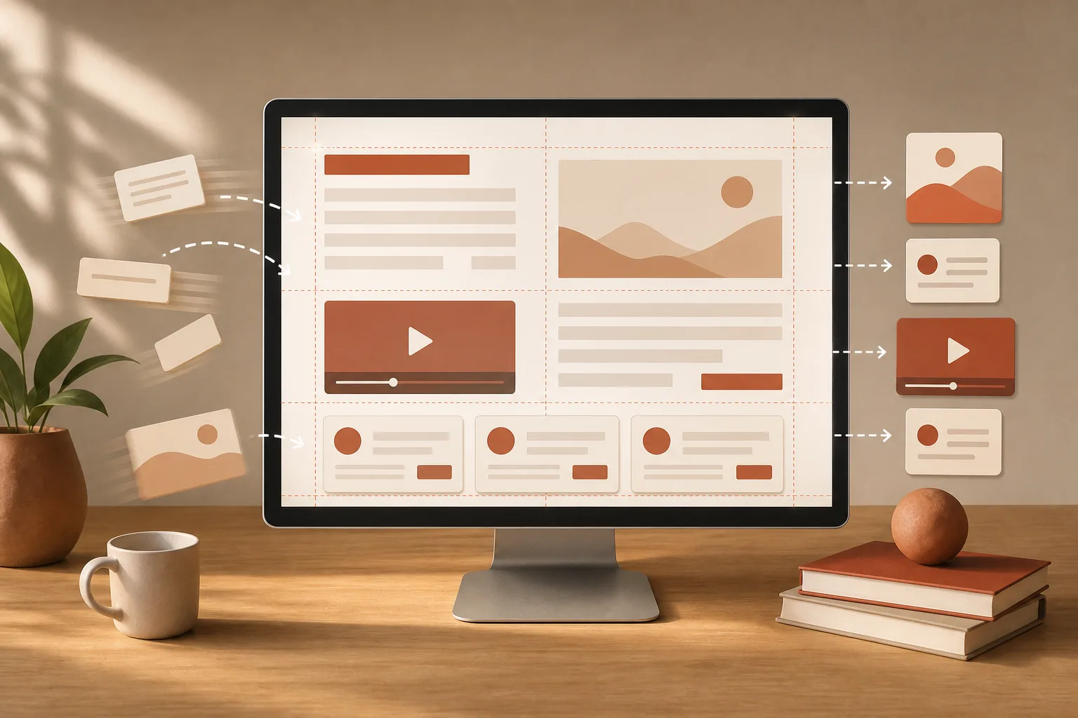
A button that drops down just as you’re about to click it, a heading pushed aside by an image or a banner that suddenly appears: these layout shifts directly disrupt reading. To reduce WordPress CLS, you should reserve the needed space before variable elements finish loading.
CLS, or cumulative layout shift, doesn’t depend only on site speed. A page can render quickly yet move around annoyingly. The most common causes are images, videos, external embeds, ad slots, web fonts, and content injected after first paint.
This article focuses on concrete fixes. To learn how to measure CLS, compare real-user data to simulated tests, and choose priority pages, see instead the method for measuring Core Web Vitals in WordPress.
Reproduce the shift before changing anything
Start by opening the affected page in a private window. Reload it several times, on desktop and mobile. A slower connection often makes movements more visible. Watch the page without clicking: which element appears, changes size, or pushes content downward?
Next, identify the first block that moves. It’s not always the culpable element. For example, a button that drops may be shifted by an image, a font, or an empty container higher up on the page.
Also note the precise context: homepage, post, product page, archive, or form. A problem limited to a single template often stems from the theme, a reusable block, or a plugin loaded on that page type.
Reserve space for images and videos
Media without known dimensions are a classic cause of shift. The browser first displays text and neighboring blocks. Then, when it learns the media’s actual size, it frees the required space and moves what follows.
In the WordPress editor, insert images from the media library using the Image block rather than by uncertain pasting or external embed. The block lets you choose a size, aspect ratio, and display dimensions. The official documentation for the WordPress Image block explains, in particular, the ratio, width, and height settings available in the editor.
Check images added outside the editor
Inspect areas that use background images, custom banners, partner logos, or images loaded by a plugin. These elements don’t always get the same protections as images placed in a standard block.
- Give each visual area a stable ratio, even if the image loads later.
- Keep the same ratio for images in a card or product grid.
- Avoid replacing a small image with a visual of a very different shape after publication.
- Check rendering on phones, because a cropped image may require more height there.
Modern formats can reduce file weight, but they don’t replace reserving space. To choose an appropriate format without confusing compression with visual stability, read how to choose between WebP and AVIF for WordPress images.
Stabilize video players and embeds
An embedded video, map, third‑party form, or social post may render after the rest of the content. So provide an area with a consistent height or ratio before the embed loads.
Don’t hide an empty container that will later receive an embed. That approach looks clean at first, but it forces the page to reflow when the external service responds. Instead show a simple placeholder that matches the expected final format.
Frame ads, promotions, and blocks injected late
Ads and modules added by script can arrive after first paint. If no space is allocated, they then push content around. The web.dev documentation on CLS optimization web.dev on optimizing CLS specifically cite images, ads, embeds, and injected content without dimensions among common causes.
Create an explicit slot for every block that might appear later. This rule applies to ads, consent banners, article recommendations, reviews, promotional pop-ups, and capture forms.
- Reserve a realistic height for a slot that typically displays.
- Avoid inserting a banner above content that is already readable.
- If no content is available, keep a discreet space or remove the slot altogether.
- Test pages with and without active campaigns, promotions, or recommendation modules.
A banner that opens after display deserves special attention. If it must remain, place it in an area accounted for by the layout. If it’s optional, prefer a display that doesn’t push already viewed content.
Avoid movement caused by fonts
When a fallback font displays before the chosen font, letter widths and line heights can change. Headings, paragraphs, and buttons can shift position. This becomes very noticeable with decorative fonts or many weight variants.
Reduce the number of families and weights actually used. Keep only the essential fonts for headings and body text. Also choose a fallback font whose proportions closely match the final font. That way, the visual change is less noticeable if the web font arrives after the content.
The font loading strategy should limit abrupt changes without unnecessarily blocking text. You’ll find a separate method in this guide on optimizing a WordPress theme’s web fonts.
Change animations without altering geometry
An animation can create layout shift even if it seems subtle. Properties that change an element’s position or dimensions risk pushing neighboring elements. Changes to height, width, margins, and movements using top or left, require extra caution.
For decorative effects, favor visual transforms that don’t reflow the document. The web.dev resource specifically recommends avoiding animations that trigger layout and notes that transforms with transform don’t affect other elements in the same way.
Also check dropdown menus, accordions, validation messages, and buttons that change labels. These elements can remain smooth if they open into an allocated area, rather than suddenly pushing critical content.
Isolate the extension or script responsible
When a shift occurs only after installing an extension or adding a marketing service, first investigate what’s loading on the page. Temporarily disable the module in a test environment, then repeat the same checks. A targeted fix is better than randomly disabling things permanently.
Nonessential scripts can add elements late or modify the DOM after initial render. For more, see the process for reducing unnecessary JavaScript in WordPress. It will help you bind a script to its plugin or theme before you limit it.
Validate the fix on the pages that matter
After each change, clear the relevant cache and test in a private window. At minimum check the homepage, a long-form content page, a media-heavy page and, if your site has them, transactional pages.
Finally, test on a narrow screen. A fix that stabilizes the desktop can fail on mobile if a heading wraps to more lines, an image is cropped differently, or a banner takes up more height. By testing element by element, you’ll reduce WordPress CLS without turning the page into a series of visual compromises.